← Back to home

A peek inside Home Assistant.

A few screenshots of real dashboards.

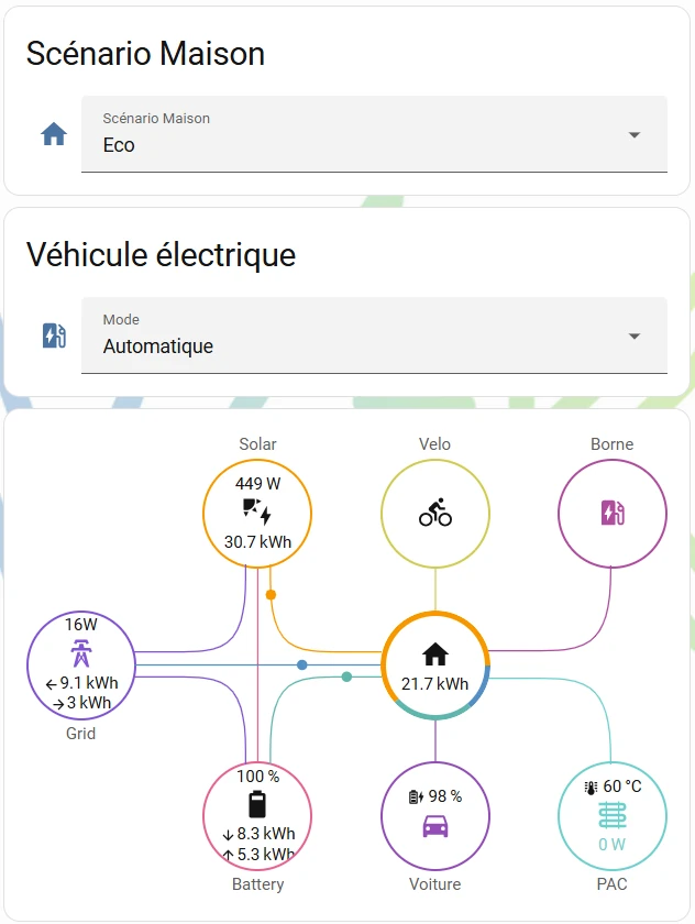
Home Assistant dashboard: the Home scenario set to Eco, the electric car mode on automatic, and a diagram of the energy flows between solar, grid, battery, house, car and heat pump
The Home scenario set to “Eco”, with live energy flows.
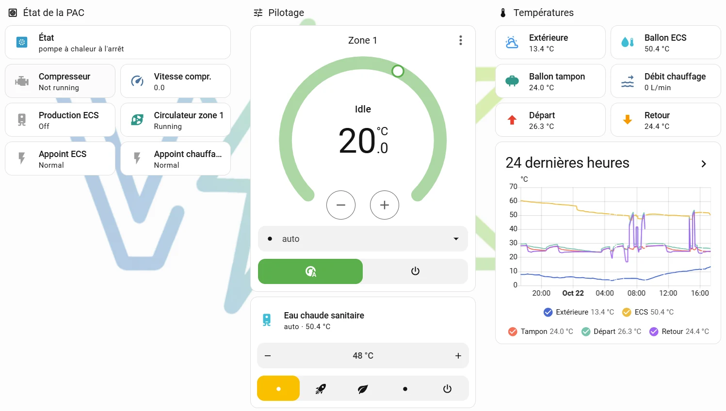
Home Assistant dashboard of a heat pump: state, heating zone, domestic hot water, temperatures and a chart of the last 24 hours
The heat pump’s state, settings and temperatures.
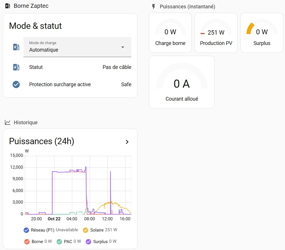
Home Assistant dashboard of an EV charging station: charging mode, status, live power readings and 24-hour history
The charging station’s mode and the power readings over 24 hours.
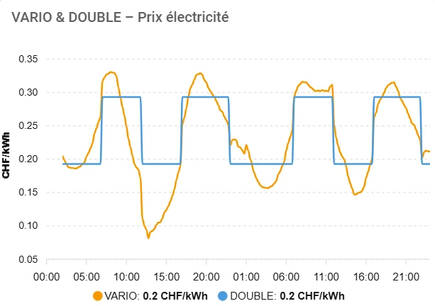
Chart of the electricity price over four days: the VARIO price in orange moves, the dual tariff in blue steps between two levels
The electricity price over several days: dynamic VARIO tariff and dual tariff.
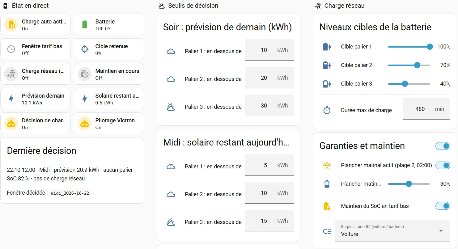
Home Assistant dashboard for battery charging: live state, decision thresholds based on the solar forecast and the battery’s target levels
Solar-forecast thresholds and the battery’s target levels.